这篇教程python绘制多分类混淆矩阵写得很实用,希望能帮到您。
对于分类问题,一般使用混淆矩阵来分析各类别预测的结果,可视化混淆矩阵来分析预测结果从而得到调参思路。
绘制多分类混淆矩阵
%matplotlib inline
from sklearn.metrics import confusion_matrix
import matplotlib.pyplot as plt
import numpy as np

def plot_confusion_matrix(cm, savename, title='Confusion Matrix'):

    plt.figure(figsize=(12, 8), dpi=100)
    np.set_printoptions(precision=2)

    # 在混淆矩阵中每格的概率值
    ind_array = np.arange(len(classes))
    x, y = np.meshgrid(ind_array, ind_array)
    for x_val, y_val in zip(x.flatten(), y.flatten()):
        c = cm[y_val][x_val]
        if c > 0.001:
            plt.text(x_val, y_val, "%0.2f" % (c,), color='red', fontsize=15, va='center', ha='center')

    plt.imshow(cm, interpolation='nearest', cmap=plt.cm.binary)
    plt.title(title)
    plt.colorbar()
    xlocations = np.array(range(len(classes)))
    plt.xticks(xlocations, classes, rotation=90)
    plt.yticks(xlocations, classes)
    plt.ylabel('Actual label')
    plt.xlabel('Predict label')

    # offset the tick
    tick_marks = np.array(range(len(classes))) + 0.5
    plt.gca().set_xticks(tick_marks, minor=True)
    plt.gca().set_yticks(tick_marks, minor=True)
    plt.gca().xaxis.set_ticks_position('none')
    plt.gca().yaxis.set_ticks_position('none')
    plt.grid(True, which='minor', linestyle='-')
    plt.gcf().subplots_adjust(bottom=0.15)

    # show confusion matrix
    plt.savefig(savename, format='png')
    plt.show()
获取实际标签、预测结果和混淆矩阵:
# classes表示不同类别的名称,比如这有6个类别
classes = ['A', 'B', 'C', 'D', 'E', 'F']

random_numbers = np.random.randint(6, size=50)  # 6个类别,随机生成50个样本
y_true = random_numbers.copy()  # 样本实际标签
random_numbers[:10] = np.random.randint(6, size=10)  # 将前10个样本的值进行随机更改
y_pred = random_numbers  # 样本预测标签

# 获取混淆矩阵
cm = confusion_matrix(y_true, y_pred)
plot_confusion_matrix(cm, 'confusion_matrix.png', title='confusion matrix')
得到如下图所示:
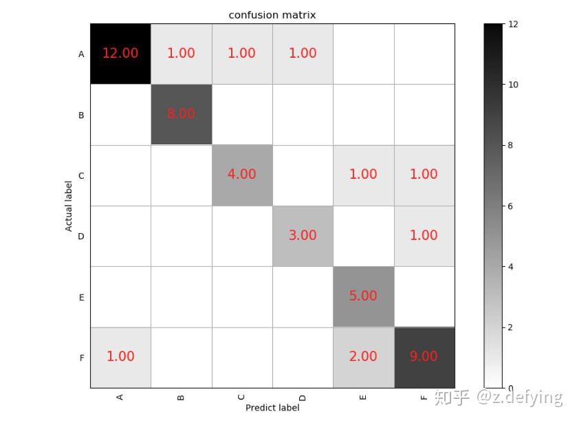
我们看类别A,预测结果和实际标签都为A的有12个样本,把A样本预测为其他类别的有3个样本(同一行的其他样本),而把其他类别预测为A样本的有1个样本(同一列的其他样本)。其他类别也同样这样分析。
通常我们会在绘图前对混淆矩阵按行做一个标准化处理,即得到的是概率值,每行所有的概率之和为1,所以对角线就代表每个类别的查全率(召回率)。
# Normalize by row
cm_normalized = cm.astype('float') / cm.sum(axis=1)[:, np.newaxis]
print(cm_normalized)
输出为如下形式的二维矩阵(和上面的混淆矩阵并不对应):
[[0.7  0.   0.   0.   0.1  0.2 ]
 [0.12 0.88 0.   0.   0.   0.  ]
 [0.   0.   0.71 0.   0.29 0.  ]
 [0.   0.   0.   0.83 0.17 0.  ]
 [0.   0.   0.   0.   1.   0.  ]
 [0.   0.   0.   0.   0.15 0.85]]
keras CNN卷积核可视化,热度图 python源代码
classification_report 保留多位小数 |